For this project from hell, Mr. Walter, I had decided to try a few new steps in the process--taking a more traditional route. Unfortunately, each step has major issues for me, but I'm learning.
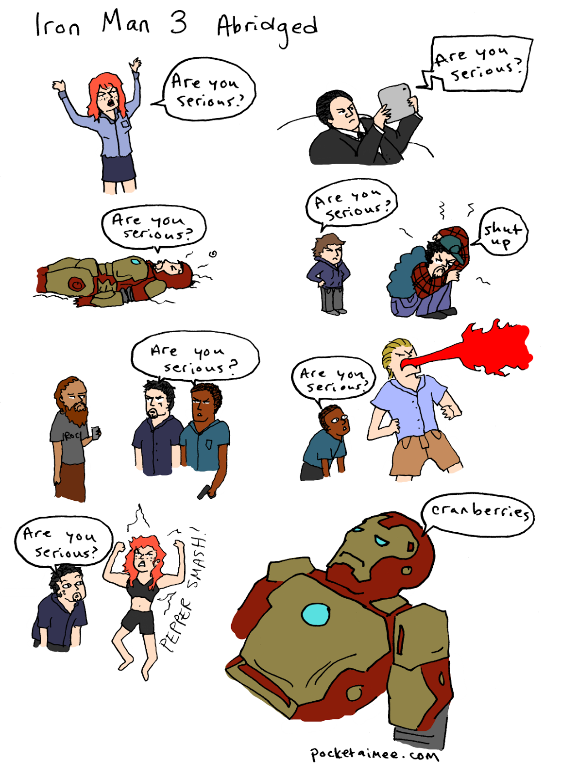
First, I skip the script because you know what? I already wrote most of this story as a novel like 10 years ago and it was terrible and I don't even want to think about it, so I'm just gonna jump straight to thumbnails and stick figures.
I drew/wrote over 400 pages of the story like this:
Once I finished the main narrative arc for this first part of the story (400 pages and the damn thing ain't even done) I went over the whole thing with a ballpoint pen so I could scan the mess and send it to my friend and my little sister to see what they thought.
Long story short, they enjoyed it. (My friend actually preferred the stick figure comic over anything else and wanted me to publish that and I may have to kill her.)
Once I got the okay, I took out the old trusty 5.5in x 8.5in Canson sketchbook (a horrendous mistake because the pages are hellaciously tiny and it's really hard to draw a comic that small) and sketched the pages in blue pencil.
They look like this:
What's nice about using blue pencil is that you don't have to erase. I've ruined too many perfectly good ink jobs by erasing. (Sometimes I wouldn't let the ink dry and it would smudge everywhere; sometimes I would end up accidentally removing the ink entirely.)
What I hate about blue pencils (even fancy blue mechanical pencil lead) is that they're waxy as hell. It's a pain to erase, hard to see, and smudges annoyingly. At least with regular pencil lead, I felt I had more control.
After the blue is down, I go over the whole smudgy, ugly mess with ink. I used to use Micron pens but I tend to break their nibs so I dabbled in Faber-Castell's PITT pens and Prismacolor and ultimately settled on Copic because I like being able to refill ink and replace nibs myself.
So this is a page with ink:
Once the inking is done, I scan the business on my cranky, cheap ass scanner at 600dpi in black and white because I'm lazy and I don't like cleaning up the pages more than I have to.
Now this is where I found myself stuck for a long time. My original ink drawing is quite... well, plain? I'm scared of black, so the pages feel off, like they need color or some kind of balance in the line work. Since I don't use brushes, the line weight generally looks and feels the same all over.
I tried to add color digitally to a few pages to see what that would do:
But I didn't quite like it. I didn't hate it, but it still felt off.
So I tried adding texture, tried coloring in watercolors and colored pencils, but I really have a terrible sense of color theory and aesthetic and it just looked like shit no matter what I did.
In the end, I decided--at the urging of my brother--to go monochromatic and I got some gray Copic markers and decided to try out a tactic I'd seen some illustrators use.
Basically, I took the original inked page, taped it to my mini-lightbox, covered that with Bristol board, and used the gray Copic markers to shade and highlight. After I added the tints, I scanned the Bristol and used my trusty Paint.net to add the grays to the original drawing as a background layer.
The grays look like this when I scan them:
And then it looks like this when I put them together:
It's... okay? I kinda like it. Better than the colors anyway, but that's just me. I'm still trying out new techniques here and there, but considering the scope and length of this crazy project (and the million more coming after it) I figure this is a good way to go.
Lastly, once these images are all scanned in and overlapped and whatnot, I go in and change the damn font of the stupid text because my handwriting is shit.
And there you go. A process. Not a good one, not the best one, but it works...?
Lastly, once these images are all scanned in and overlapped and whatnot, I go in and change the damn font of the stupid text because my handwriting is shit.
And there you go. A process. Not a good one, not the best one, but it works...?


